Over the past few months, WhatsApp has made small adjustments to the UI of the app, but a much larger redesign is on the way, as noted by the team at WABetaInfo.
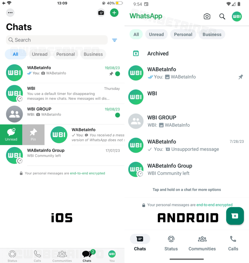
This upcoming change was once again discovered in WhatsApp’s beta releases for iOS (23.17.1.77) and Android (2.23.18.18). New colours, new buttons, and the ability to filter chats will be added to both versions of the app. View the screenshot that follows.
The top bar’s colour and the navigation tabs moving to the bottom of the screen are the two biggest changes, as seen in the image. Although it is unknown if you will be able to swipe between all the tabs like before, we do not anticipate WhatsApp to make two advances and one regression.

The new design’s dark mode is also unknown, but we suspect it will also more closely match the other dark colours on the chat screen in its bottom and top portions. To finish the look, there are many more rounded edges everywhere.
Additionally, both on iOS and Android, we are getting a filter option for our chat screen that will allow us to categorise them into unread messages, private conversations, or business chats. Additionally, iOS users now have a handy self-chat button on their bottom navigation bar, which Android users do not have.
It is likely that the updated design will be introduced to WhatsApp’s stable version soon enough since it has already begun to appear for everyone on the beta version. Remain tuned.


